 Stickers have always been an essential part of any scrapbooking arsenal. Sometimes an old-fashioned looking sticker with the white borders is just what I need to complete a layout. I have created a quick way that I like to make DoodleBats look like stickers with the help of Photoshop.
1. First, pick out a DoodleBat for your subject and pick out a color for the DoodleBat. I always start by duplicating the DoodleBat layer, so I have two of the same images exactly on top of each other. For my image I used letter Z from DB Food Fun. You may think it's corny (hee hee) but I love this DB.
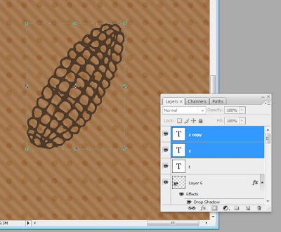 2. Next, select the bottom layer, go to the layer styles and add a “Stroke.”
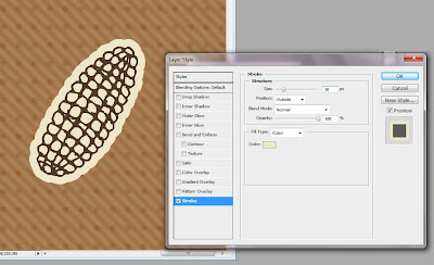
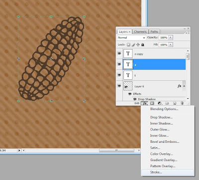 This will automatically add a 3 pixel red line around every edge of your layer. A pop-up window will also appear so you can customize your stroke. I don’t want red so I changed the color to beige by clicking the color box and picking a new color. I also wanted my line to be thicker than 3 pixels so with the scale marked “size” I dragged the size up to 30 pixels. That’s just about right for a sticker border look. Click “OK.”
 3. If you still have holes in the middle of the DoodleBat image, don’t fret, will color those in. First we have to right-click on the layer in the layer window* and click “Convert to Smart Object.” This will make the layer style (the stroke) part of the image.
*Note, when right-clicking on a layer make sure you click in the grey area next to the name of the layer. If you click on the little image icon of the layer you will get a different drop-down menu.
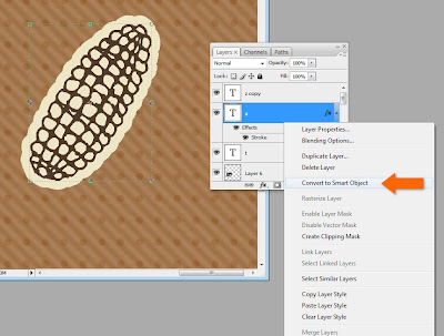 4. Then we have to right-click on the layer again and hit “Rasterize Layer.” This will allow us to be able to color on the layer.
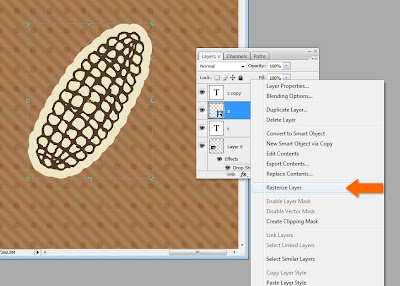 5. Next, go on and pick your brush tool, pick your color(s) and let out your inner child as you color. As long as you keep all your work on the bottom copy layer, the DoodleBat image will be uninterrupted on top.
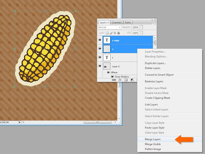
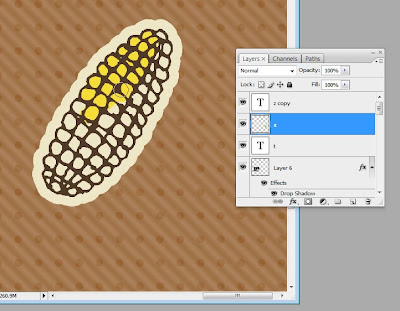 6. Once you’re done coloring, select both layers of the DoodleBat that you copied in the beginning. Right-click on the bottom layer* and select “Merge Layers.”
*Note, if you right-click on the top layer you will get a different drop-down menu related to fonts, since that layer is still a font layer.
 7. Now it’s time for the final touches. Select the layer again and go to layer styles. I always add a drop shadow. Sometimes I also add an inner glow (in the form of a linear burn) to make it look aged. You could also add texture or a bevel to make it bubble out.
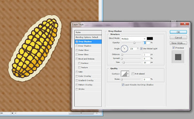 The sky is the limit. There is always more than one way to skin a cat, and that is especially true when your toolbox is Photoshop. If you’re new to Photoshop or Photoshop Elements, play around, get yourself comfortable with one menu option at a time. Most of all, don’t get discouraged. There’s a lot of amazing stuff you can do.
Here is the final layout I used my corny stickers for.
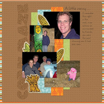 For the leaf and corn bundle stickers I used DB Fall Doodles. For the title font I used LD Maze, on clearance now for 50¢ (it was perfect for this layout). For the journaling font I used Scrap Happy, also on clearance now. The paper is from Lettering Delights 365 Days Paper Pack.


